 Photos and stories need to complement each other. That's sounds simple enough, but it doesn't always happen in print or online.
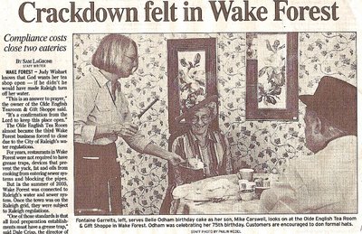
This example from the North Raleigh News illustrates how this can go wrong. The story is about regulations that require restaurants that get hooked up to city water to get grease traps. Those that fail to comply are subject to the "crackdown" mentioned in the headline. (That word choice isn't the best, and "costs" in the drophead is mildly confusing because it can be read as either a noun or verb.)
The photo is from a restaurant that had to deal with the regulations, and it shows a birthday celebration. Its festive tone is a mismatch with the story's content, and it clashes with the headline. The drophead implies that the restaurant in the photo is one of the ones that's been shut down. The photo doesn't connect the reader to the central message of the story: Some restaurants are having a hard time complying with these regulations.
So what to do? Here are some options:
- Ask the photo desk for another photo.
- Bust the photo.
- Write the cutline to tie the package together. This can feel contrived, but at least give it a try.
- Rewrite the headlines to better link the image to the story.


Somebody oughta crack down on that wallpaper.