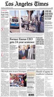
The Los Angeles Times has redesigned, bringing in all-caps headlines and other devices to the front page, among other changes. It seems pretty tame as these things go.
Still, some readers don't like the new look and reorganization. Their comments include the inevitable comparisons to USA Today. That always seems to happen when any newspaper has a redesign, doesn't it?
